Essential Principles for Effective Data Visualization
Introduction
Did you know that humans process visuals 60,000 times faster than text? In the realm of data science, where every bit of information counts, this statistic underscores the transformative power of data visualization. Data visualization is not just about making pretty graphs; it’s about making data accessible, understandable, and actionable. In a world drowning in data, the ability to distill complex datasets into clear, insightful visuals is nothing short of a superpower.
The importance of data visualization in data science cannot be overstated. With the right visualization, patterns hidden in the data can emerge as clear insights, misleading noise can be filtered out, and the most subtle nuances can become evident. It’s a critical tool for data exploration, hypothesis testing, and communicating findings to both technical and non-technical audiences alike.
The Power of Visual Data Interpretation
Data visualization is a cornerstone of data science for several compelling reasons. It transcends the mere presentation of figures; it’s an essential part of the analytical process, enabling data scientists and stakeholders to uncover insights and make informed decisions. Here’s why visualization holds such a crucial role:
Immediate Insight: Visualizations enable immediate insight into complex data sets. Where spreadsheets or reports might take hours to comprehend, a well-crafted chart or graph can convey the same information at a glance.
Pattern Recognition: Humans are naturally visual creatures, and our brains are wired to recognize patterns and outliers quickly when presented visually. Data visualization leverages this by highlighting trends, cycles, and anomalies in data that might go unnoticed in text-based data.
Facilitates Communication: Visual data representations can bridge the gap between technical and non-technical audiences, making complex data more accessible. It’s easier to explain and discuss findings with a visual reference point, fostering better understanding and collaboration across diverse teams.
Examples Demonstrating the Impact of Visualization:
Heat Maps for Weather Data: Heat maps can illustrate variations in temperature across different geographic locations at a glance, making it easier to identify hotspots and climate patterns than sifting through tables of temperature data.
Line Graphs in Financial Analysis: Line graphs depict the fluctuations in stock prices over time, providing investors with a clear picture of market trends and helping them to make quicker investment decisions.
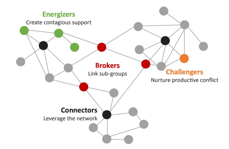
Network Diagrams in Social Science Research: Network diagrams visualize relationships and social connections, highlighting key influencers or clusters within a community that might not be evident from raw data alone.
Cognitive Aspects of Visual Information Processing:
Faster Processing: Visuals are processed in the brain’s occipital lobe, allowing for faster and more efficient assimilation of information compared to text, which requires sequential processing and a higher cognitive load.
Memory Retention: Visual information is more likely to be remembered than text. The phenomenon, known as the picture superiority effect, means that data presented visually has a better chance of being recalled accurately.
Engagement and Emotion: Visuals can evoke emotions and engagement more effectively than text, making them powerful tools for storytelling with data. This emotional connection can make the message more persuasive and memorable.
Principle 1: Clarity and Simplicity
In the art and science of data visualization, clarity and simplicity are not just aesthetic choices; they are foundational principles that determine the effectiveness of the visual message. Here’s why prioritizing these elements is essential:
Enhanced Comprehension: Simple and clear visualizations are easier to understand. They direct the audience’s attention to the most important parts of the data, facilitating quicker and deeper comprehension.
Effective Communication: When the goal is to communicate complex data insights, clarity ensures that your message is not lost in translation. Simplicity makes it accessible to a wider audience, regardless of their expertise.
Increased Engagement: Audiences are more likely to engage with visualizations that are easy to interpret. Overly complex visuals can lead to frustration and disengagement.
Tips for achieving clarity and simplicity:
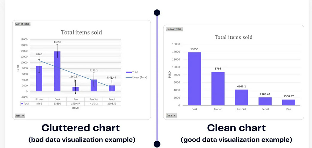
Minimize clutter: remove any elements that do not contribute to understanding the data. This includes excessive labels, grid lines, and colors.
Use Clear Labels and Legends: Ensure that all labels are easy to read and understand. Legends should be concise and placed close to the related data.
Limit Your Color Palette: Too many colors can confuse and distract. Use color deliberately to highlight significant data points or to group related items.
Focus on One Main Message: Each visualization should convey a single key insight. If you have multiple messages, consider using multiple charts.
Examples of Clear vs. Cluttered Visualizations:
Principle 2: Choose the Right Chart Type
Choosing the right chart type is crucial for effective data visualization. The choice of chart impacts how well the data’s story is understood and can be the difference between clarity and confusion. Different chart types are suited for different kinds of data and analytical purposes.
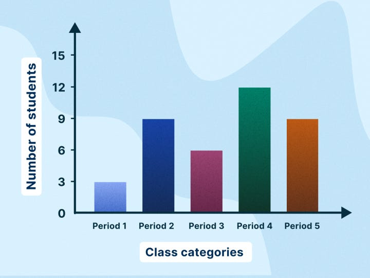
Bar charts are ideal for comparing quantities across different categories. Use vertical bars for general comparisons and horizontal bars when category names are long.
Line charts are best for showing trends over time. Each line in the chart connects data points that represent sequential changes in the value of something.
Scatter plots are excellent for displaying the relationship between two variables. Points on the scatter plot can reveal correlation patterns or clusters.
Pie charts are suitable for showing parts of a whole. They are most effective when there are a limited number of categories and the focus is on proportionate sizes.
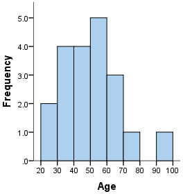
Histograms are used to show the distribution of a dataset across different bins or intervals. It's great to see the shape of your data’s distribution.
Guidelines for Selecting the Right Chart Type:
Identify your goal: Decide whether you’re comparing values, showing a distribution, illustrating a relationship between variables, or demonstrating a composition of data.
Consider your data: The nature of your data (categorical, time series, continuous, etc.) will influence the most effective way to visualize it.
Simplicity is key. Choose the simplest chart that accomplishes your goal. Overly complex charts can confuse your audience.
Follow Data Visualization Best Practices: Ensure that your chart adheres to best practices in data visualization for accuracy and integrity.
Principle 3: Color Usage
The strategic use of color in data visualization can significantly enhance the effectiveness of the presented data, aiding in differentiation, emphasis, and emotional impact. However, improper use of color can just as easily detract from the data, leading to confusion, misinterpretation, and a visually unappealing presentation. Here’s how color plays a critical role in data visualization and some guidelines to harness its power effectively.
The Role of Color in Data Visualization:
Differentiation: Color helps in distinguishing between different data sets or categories within a visualization, making it easier for the audience to follow and understand distinct parts of the data.
Emphasis: Using color strategically can draw attention to key data points, outliers, or areas of interest, guiding the viewer’s focus to important insights.
Aesthetic Appeal: Color adds visual interest and can make data visualizations more engaging and memorable to the audience.
Emotional Influence: Colors can evoke emotions and influence perception, which can be leveraged to highlight the urgency, trends, or relevance of the data presented.
Guidelines for Choosing Color Schemes:
Use Contrasting Colors for Clarity:
Contrast helps in distinguishing different elements in the visualization. For instance, use contrasting colors for the background and foreground to ensure legibility.
Here’s an example of using contrasting colors for clarity in a visualization. In this plot, a black line (high contrast color) is used to represent the data against a white background. This choice ensures legibility and makes the data stand out clearly. The use of a simple grid with light gray lines further aids in reading the chart without distracting from the main data.
Limit your palette:
Too many colors can overwhelm and confuse the viewer. Stick to a limited color palette, ideally 2–4 main colors, and use shades of these colors for differentiation.
In this bar chart, a limited color palette with different shades is used to represent four distinct categories. This approach emphasizes each category uniquely while maintaining a cohesive visual theme, illustrating how a restrained use of color can effectively convey information without overwhelming the viewer. The distinct colors for each bar make it easy to differentiate between categories at a glance, showcasing the value of a limited palette in data visualization.
Be mindful of color associations.
Different colors can evoke different emotional responses and cultural associations. For example, red often signifies urgency or decrease, while green can indicate growth or safety. Use these associations to your advantage, but be aware of cultural differences in color perception.
Ensure Accessibility:
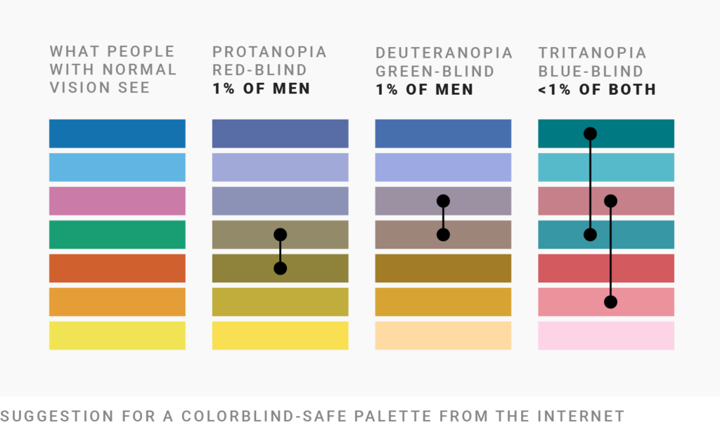
Choose color palettes that are accessible to people with color vision deficiencies. Tools like Color Oracle or WebAIM can help simulate how your visuals appear to viewers with colorblindness.
Highlight, Don’t Distract:
Use bright or saturated colors to highlight important data points and neutral or muted colors for less significant information. This helps maintain the viewer’s focus on what matters most.
Common color pitfalls to avoid:
Overuse of Colors: Using too many colors can create a chaotic and confusing visualization that’s hard to decode.
Ignoring Cultural Contexts: Colors have different meanings in different cultures. Ensure your color choices do not convey unintended messages to a global audience.
Lack of Consistency: Using colors inconsistently across multiple visualizations can confuse the audience. Maintain the same color schemes across related charts for continuity and easier comparison.
Illustrating the Impact of Color Usage:
A pie chart with too many similar colors might make it difficult to distinguish between slices, whereas using a distinct color for each slice with a consistent legend can clarify distinctions.
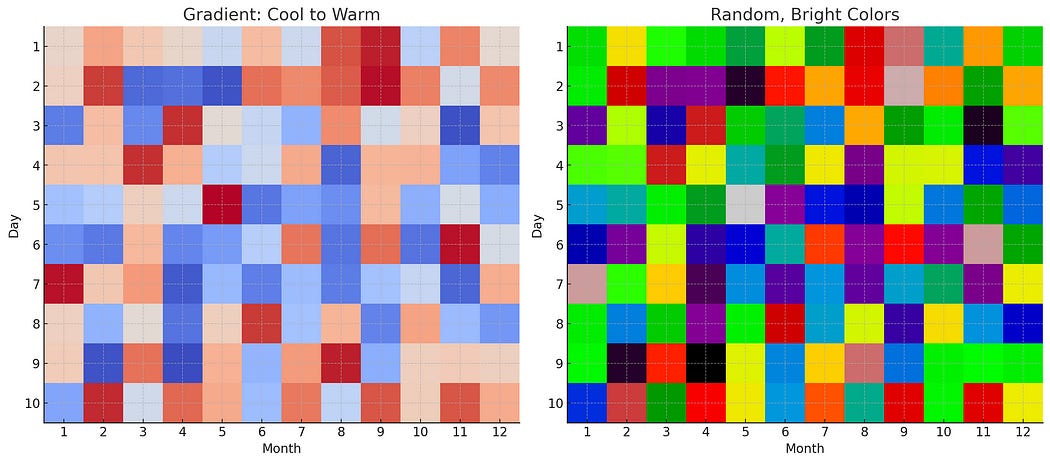
A heat map using a gradient from cool to warm colors can effectively show density or concentration in data. However, a heat map with random, bright colors might obscure patterns rather than highlight them.
Properly leveraging color enhances not just the aesthetic value but also the overall comprehension and effectiveness of data visualization. By following these guidelines, you can ensure that your visuals are not only visually appealing but also accessible and informative, making your data storytelling more impactful.
Principle 4 : Storytelling with Data
Storytelling with data is a powerful technique that goes beyond mere presentation, transforming numbers and statistics into a narrative that engages and informs. Effective data visualization plays a crucial role in this process, turning abstract data into a compelling story that can inspire action, convey insights, and illuminate trends. Here’s how to leverage data visualization for storytelling:
Highlighting the Narrative Power of Data Visualization:
Engage Your Audience: A well-told data story captivates the audience, making them more receptive to the insights being presented. Visuals can evoke emotions and drive home the impact of data in a way that numbers alone cannot.
Simplify Complex Concepts: Visualizations distill complex data into digestible chunks, making it easier for the audience to understand and retain the information.
Reveal Trends and Patterns: Through visualization, hidden trends and patterns emerge, telling a story of change over time, relationships, or causality that might not be evident from the raw data.
Techniques for Narrating a Story Through Data Visuals:
Start with a clear message: Before you create your visuals, know the story you want to tell. What’s the main message or insight you want your audience to take away?
Use a Logical Sequence: Structure your visualizations to guide your audience through the narrative logically. Begin with establishing context, move through the analysis, and end with a conclusion or call to action.
Highlight Key Points: Use visual elements like color, size, or annotations to draw attention to the most important data points that drive your story forward.
Incorporate Visual Variety: Different types of visualizations can keep the audience engaged and help illustrate different aspects of your story. Use a mix of charts, graphs, and images as appropriate.
Connect the dots: Use text, captions, or interactive elements to explain how each visualization contributes to the overall narrative. Don’t assume the visuals speak for themselves.
Conclusion:
In conclusion, mastering the principles of effective data visualization is crucial for anyone looking to convey complex data in a clear, engaging, and insightful manner. From choosing the right chart types and using color wisely to ensuring clarity, simplicity, and accessibility, these principles serve as the foundation for creating visuals that not only present data but tell a compelling story.
Whether you’re a data science professional, a business analyst, or anyone who works with data, refining your visualization skills is an ongoing journey that can lead to more meaningful data-driven decisions and communications.


